Wednesday 29 April 2015

Editing (We Are The Best!)

Part Four - Editing

We Are The Best!Lukas Moodysson (2013)


We Are The Best! is a film based on the semi-autobiographical graphic novel of Lukas Moodysson's wife and as such it explores the strong themes of adolescence and punk spirit through well thought out editing. This film "smacks of lived experience with all its awkward nostalgia and remembered embarrassment [...]" [3]

An example of one of the more "erratic" hand-held camera shots of Bobo and her friends.
The editing style of the film is fast paced and this is accentuated by a very mobile camera. Towards the beginning of the film we see a lot of still shots but the further into the film we get the more handheld camera shots are used. Together with "ragged editing rhythms to match - [it] feels uncannily true to the episodic, pell-mell rhythms of adolescence." [1] This is emphasized by the transitional editing techniques that are used. For example there is an unusual level of zooming used to transition between shots which has quite a jarring effect. The zooming almost ‘screams’ at you and this reflects the erratic punk rock music that is central to the film. 
There is also the use of jump cut shots which has a counter-continuity effect also known as disjunctive editing. Corrigan and White state that “when the viewer is asked, or even forced, to reflect on the meaning a a particular cut because it is so jarring […] he or she not only participates more fully in the film experience but may also develop a critical perspective on the film’s subject matter or on the process of representation itself." [2] This disjunctive editing also makes the film seem more fast paced in the beginning and slower towards the end. This could simply be that the shots are longer towards the end than they are at the beginning or it could also be argued that its because we were more attentive to the techniques at the start and had become used to them as the film went on. Either way as the film progresses we are drawn more and more into the themes and content of the film due to the film form used.

One of the rare shots of Bobo and her two friends all in the same shot, although we can see she is on the far edge of the screen while the other two are in focus (use of depth of field)
The editing that is used also plays a key role in capturing a sense of the young girls aspirations, energy and emotions, involving us in the narrative drive and tensions of the story. An important example of this is when Bobo climbs up onto the roof with her friends. The jealousy and isolation that Bobo feels comes through in the editing of this shot. Bobo is always standing away, on the edges of the frame, and we rarely see all three characters in the same shot. Therefore a shot-reverse shot technique is employed and this emphasizes the distance in physical space and ideals between Bobo and the other two characters. At the end of the scene we are also subjected to a long shot of Bobo walking along the roof top. this is one of the longest takes in the whole film and the film form makes us uncomfortable because we are unsure whether or not she is going to jump. The duration of this take builds up the tension and it means so much more for the audience when she doesn't jump.
The way the film is made serves the content of the film. The film form tells more about the psychology of the girls than the characters themselves do.

Works Cited:
[We Are The Best!. Dir. Lukas Moodysson. Film i Vast, Memfis Film, 2013. Film]
[1] The Guardian. 30 April 2015. Web. <http://www.theguardian.com/film/2014/may/28/we-are-the-best-film-review-spirited-anarchy>
[2]Timothy Corrigan and Patricia White, The Film Experience, 3rd ed. Boston, New York: Bedford/St Martins, 2004, 2009, 2012. Print.
[3]The Guardian. 30 April 2015. Web. <http://www.theguardian.com/film/2014/apr/20/we-are-the-best-review-lukas-moodysson>
[Google Images]
Cinematography (The Grand Budapest Hotel)

Part Three - Cinematography

The Grand Budapest Hotel

Wes Anderson (2014)


The Grand Budapest Hotel has perhaps the most complex and theatrical narrative of a film I have ever seen. Wes Anderson’s style as an auteur, means this film has a storybook quality which is accentuated by the fantastic cinematography he uses in collaboration with his cinematographer Robert Yeoman. From the camera shots to the very ratios of the film frame we are presented the stories of the characters "in an illustrative style that's both theatrical and cinematic." [1]

An example of a still that has portrait qualities, in this particular shot they were actually taking a photograph.

Corrigan and White state that “the shot is the visual heart of the cinema”. [2] Wes Anderson frames his shots, quite often a medium close up or a long shot, very similarly to portraits. Yeoman explains in an interview that at the beginning of every day he will have the distances from the camera to the walls measured to "ensure that the camera is perfectly centered." [3] He says this is "pretty standard practice." [3] This means that every still shot is almost perpendicular to the ‘horizon’ of the shot. The film actually draws inspiration from posed group photographs from the 1930s. Yeoman said that Anderson had done research into these old photographs and "those old photos influenced the way we framed some of those scenes." [3] This not only links the film form to the era that the content is set in but also creates a picture image for the audience to look at that is aesthetically intriguing. An example of this is when Zero is getting ready for the day in his small room. The camera is set almost dead center and the shot is a level angle. This creates the impression that the camera is sitting where the mirror would be sitting as Zero traces his mustache on with a pencil. It could be argued this techniques makes the shots monotonous, but with Anderson "varies his images by departing from straight-on angles" [4] and thus creates a more visually stimulating experience for his viewers.

Long shot from a high angle


Mid shot from a level angle


Another important aspect of Anderson’s cinematography is the aspect rations that he uses. He switches between different ratios for the different time periods that a particular scene takes place. Bordwell writes that it is 1.85 for the present and the authors recounting of the meeting in the 1980s, it is 2.40 during this meeting in 1960 and it is 1.37 or 4.3 in the central story of the 1930s. In effect each era gets an aspect ratio that could have been used in a movie of that time. This aspect of the film form reflects the changing temporal structure of the content. It emphasizes for the audience the elasticity of time within the film.

Perhaps the most remarkable film convention that Anderson uses is the ‘whip pan’ that he uses to transition the bulk of his shots. It’s a tricky maneuver that required precise control over the camera. "The idea was to keep the rhythm of the scene very quick when the characters are speaking much faster than they would in regular life," said Yeoman. [3] He said that instead of the decisive cutting of a shot this type of tilt transition tied everything in together because it was the same shot. This convention of film form also added an element of chaos to the already hectic display in the film. This technique coupled with the repetitive use of shot reverse-shots during some parts of dialogue makes an audience feel as though sequences are going at a faster pace.
This film technique and some other intriguing sequences can be viewed at: https://www.youtube.com/watch?v=Fshq_HlXroQ

Works Cited:
[The Grand Budapest Hotel. Dir. Wes Anderson. American Empirical Pictures, Indian Paintbrush, Babelsberg Studio, 2014. Film.]
[1]The American Society of Cinematographers. 29 April 2015. Web. <https://www.theasc.com/ac_magazine/March2014/TheGrandBudapestHotel/page1.php>
[2]Timothy Corrigan and Patricia White, The Film Experience, 3rd ed. Boston, New York: Bedford/St Martins, 2004, 2009, 2012. Print.
[3]Fast Company Create. 29 April 2015. Web. <http://www.fastcocreate.com/3042296/shooting-the-oscars-most-centered-movie-the-precision-filmmaking-behind-grand-budapest-hotel#1>
[4]David Bordwell's Website on Cinema. 29 April 2015. Web. <http://www.davidbordwell.net/blog/2014/03/26/the-grand-budapest-hotel-wes-anderson-takes-the-43-challenge/#top>
[Google Images]

    Tuesday 28 April 2015

    Part Two - Sound (Spirited Away)

    Part Two - Sound

    Spirited Away

    Hayao Miyazaki (2001)


    In addition to Miyizaki’s beautiful animation, he has built the world of his film through music and sound effects. Corrigan and White state “sound engages viewers perceptually provides key spacial and story information and affords an aesthetic experience of its own.” [1] In Spirited Away we are given the world of the spirit bathhouse through a multitude of sound techniques. We are also engaged emotionally through the poignant orchestral music that is present through almost the entire film.
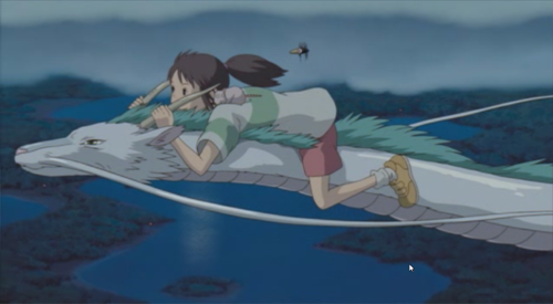
    MLS of Chihro and Haku flying through the air.
    An important aspect of the sound in Spirited Away is the orchestral music that permeates the film from beginning to end. Hayao Miyazaki employed the accomplished composer Joe Hisaishi who composed the emotive score and conducted the New Japan Philharmonic Orchestra to bring it alive. “Hisaishi’s musical arrangement of the score features contrasting effects produced by the brass and string instruments, the former for dramatic and strident mood and the latter for a lighter and more whimsical effect.” [3] For example in a crucial scene towards the end of the movie, Chihiro has a flashback and remembers Haku’s real name in what is arguably the turning point of the film. The music at the beginning of the sequence is triumphant and stirring and through this non-diegetic sound we can appreciate Chihiro’s feeling of accomplishment along with her. Then as she remembers the crucial moment of the past the music all but disappears and this provides us with a point of emphasis and we understand how important this moment is to the narrative. It “provides rhythm and deepens [our] emotional response” [1] to what had occurred. In addition “silence and stillness relate to Japanese art forms” [3] which reminds us of the origins of the film.
    While this act of placing the non-diegetic musical score in the film breaks the verisimilitude of the piece we readily accept this convention of film form because, despite this, it draws out our emotional response to the content more than if there were no music. Films flatten with lack of sound and the addition of an emotionally stirring score gives it more body and substance.
    Mouse and Bugbird, as they are the focus the diegetic sound of their flying is louder.
    Another important aspect of the sound in Spirited Away is the carefully crafted diegetic sound effects that create the whole world of the film.
    The bulk of the film takes place in a bath house and to create the sounds for this specific setting Miyazaki and his sound engineer Mr Inoue went to the Kusatsu spas to record the natural sounds there. The also recorded the sounds for the kitchen in a restaurant. “In the studio sounds were added one by one to every small movement” [2] by Mr Noguchi, who has been adding sounds to animation for 20 years. Everything was thought about and engineered in detail because “virtually nothing appears onscreen that does not make its corresponding noise.” [1]
    An example of this diegetic sound is when the transformed baby and eagle are flying around Chihiro. The buzzing sound they make gets louder and quieter the closer they fly to Chihiro’s head. This places us, the audience, into the narrative and makes us feel as though we are a part of it to. It is the small details like these that create the verisimilitude that helps us to closer analyse the important themes in the film.

    Works Cited:
    [Spirited Away. Dir. Hayao Miyazaki. Studio Ghibli, Dentsu Inc, 2001. Film]
    [1] Timothy Corrigan and Patricia White, The Film Experience, 3rd ed. Boston, New York: Bedford/St Martins, 2004, 2009, 2012. Print.
    [2]Designing Sound. Web. 29 April 2015. <http://designingsound.org/2009/12/the-sound-of-spirited-away/>
    [3]HSC Extension Course Support Materials. Web. 29 April 2015. <http://www.quia.com/files/quia/users/bakersensei/ext_japanese1.pdf>
    [Google Images]

    Part One - Mise-En-Scene (12 Years a Slave)

    Part One - Mise-En-Scene

    12 Years a Slave
    Steve McQueen (2013)

    With its entrancing but often brutal content, Steve McQueen's 12 Years a Slave gives "an eerie feeling where you're torn between looking away due to the brutality" [1] or admiring his unflinching use of mise-en-scene. His blocking and settings especially give imporatant focus to the content and themes of the film. To quote LarsonOnFilm it's "clear from the start that this movie isn't content to simply be viewed. The picture stares back." [2]


    MLS from the opening sequence of 12 Years a Slave
    A very important aspect of mise-en-scene and perhaps one of the most relevant for 12 Years a Slave is the setting or set. The setting for this film is 1940s America, in the south. This is important for the set as it justifies the cotton and sugarcane fields that the slaves worked in. The opening shot of the film is notable not only for it's composition and length of time but also for its set. We are placed instantly into a sugarcane field with the slaves looking into the camera, at us. The tightness of the medium long shot is emphasized by the sugarcane surrounding the slaves who are bunched together. This reflects the crushing claustrophobia that is prevalent throughout the film. We constantly see shots of Soloman trapped by the set; the small shared hut he sleeps in, the cotton fields. Even when Soloman finds himself in the ‘space’ outside the plantation, and we hope that he might escape, the set closes in around him, the tress towering over him and grabbing at him as he flees.
    LS of Soloman hanging in 21 Years a Slave
    This can be viewed at 
    https://www.youtube.com/watch?v=92AmGY8P2po

    Another crucial aspect of the mise-en-scene in the film is the blocking, or placement, of mise-en-scene in the shot. Corrigan and White give the two definitions of blocking; “social blocking describes the arrangement of characters to accentuate relations among them [and] Graphic blocking arranges characters or groups according to visual patterns […]” [3]
    In an especially significant scene, Soloman is left hanging by rope, barely breathing. This is a wide shot which “feels as though it goes on forever” [1] and presents social blocking of the characters around him. Gradually the other slaves on the plantation drift out of their huts and go about their usual business. They stay away from his general area and avoid acknowledging him. At one point we see children playing in the grass and this juxtaposition of the horror and innocence of children also emphasizes the idea in the film that slavery was an everyday reality, even for the people suffering under it's regime.
    Graphic blocking is demonstrated in a scene between Solomon, Master Tibeats and Master Ford, where the three stand with Master Ford in the middle. This scene effectively draws out the segregation of views as well as race prominent in the film by placing the white man and the black man on opposite sides of an arguably impartial third party.

    MLS of Soloman in his costume before he was captured
                                 
    MLS of Soloman in his costume after he was captured
    The costume element of mise-en-scene also deserves a mention as it reflects Soloman’s journey from freedom to slavery to great effect. At the beginning Soloman is wearing a costume that could be deemed aristocratic, very similar to the other gentleman around him in the north. However when he is captured his costume reflects this change by becoming drab, plain clothing that looks uncomfortable and dirty. These costumes “define” him as a character and “contribute to the visual impression and design of the film overall.” [3]

    Works Cited:
    [12 Years a Slave. Dir. Steve McQueen. Regency Enterprises, Plan B Entertainment,Film4 Productions, Summit Entertainment, 2013. Film.]
    [3] Timothy Corrigan and Patricia White, The Film Experience, 3rd ed. Boston, New York: Bedford/St Martins, 2004, 2009, 2012. Print,
    [Google Images]